Input Field
Input Fields are GUI Objects which allow for text input from the user. When the user clicks on an Input Field, the onscreen keyboard (OSK) will popup to allow text input on touch screen devices.
To implement an input field in guiDesigner:
- Select the input field tool icon
 on the tool bar.
 - Then draw a box roughly the size of the input field you wish to use. This size can be edited later on.
- You will then need to add a theme to the input field. To do this, select an input field theme from the Theme Library and drag it onto the input field you just added.
You can also drag an input field theme directly from the Theme Manager or Theme Library onto an empty spot on an open page, and the input field will be automatically created at the drop point and assigned the theme you dragged.
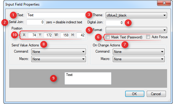
Input Field Properties
To access the input field propertiess, right click on the input field and choose Input Properties.

1 - Text
The default text that will displayed in the input field's text box when input is blank or empty.
2 - Serial Join
Assign a serial join number for the input field for dynamic text, URLs, webview URLs, etc.
3 - Theme
Select the text theme you would like to use. This choice is derived from the text themes you have defined in your project within the Theme Manager.
4 - Digital Join
Assign a digital join for the input field.
5 - Format
The format type of text input that the user is expected to enter via the OSK. There are four type of format:
- Default : Receives all text inputs.
- Numbers and Punctuations : Receives only text inputs that are consists of numbers and punctuations
- URL : Receives text inputs in hyperlink format.
- Number Pad : Receives only numbers as input.
- Email Address
6 - Mask Text & Auto Focus
Checking the Mask Text (Password) checkbox will hide the characters that is being entered and replaced by dots similar to as in how password is shown as it's being entered. When the Auto Focus checkbox is checked it will bring up the OSK automatically.
7 - On Change Actions
Command or macro for “On Change Actions” will be run for every individual input key that is typed or changed on the OSK.
8 - Send Value Actions
Command or macro for “Send Value Actions” will only be run when the full input string is entered and when the “Done” button on the onscreen keyboard (OSK) is pressed.
9 - Preview Window
This window will show the preview layout and position of the displayed text of the input field.
10 - Position
This option allows for manual entry of the position and size of the input field.
- X Position
- Y Position
- Width
- Height